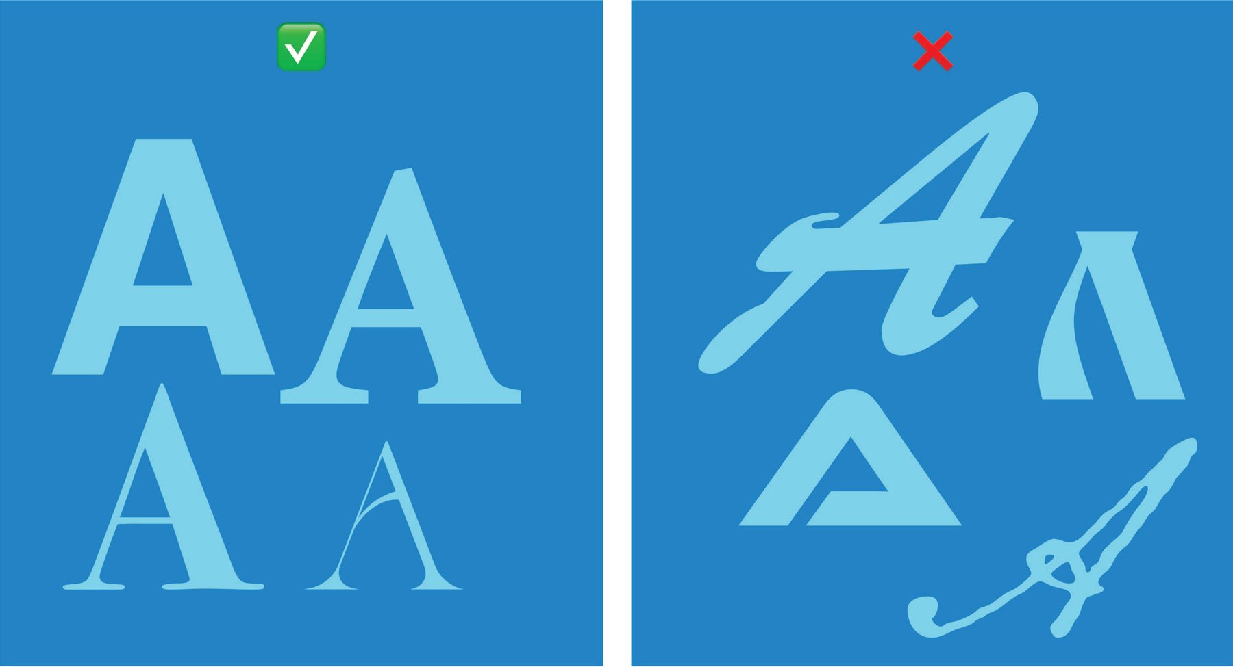
Best and Worst Fonts for Signs
Are you looking to create a long-lasting visual impression on your audience, then what better way than picking out eye-catching lettering? Fonts are like social media pages; we notice only the most beautiful, ugly, and funniest posts. Then we skip the rest of the posts without taking notice of them.
The type style of your banner will determine if onlookers will notice your banner or not. It is the most significant choice to make when creating your banner. When you want to design a banner, ask yourself: what is the best lettering for this poster? Which typeface is easy to read? How do I know a bad type-style? What colors should I use to make my characters noticeable? To get the answers to these questions, let us first look at the different categories of type styles that we have. 
Font categories
A font is a group of glyphs combined that belongs to one typeface. There are various typeface classes. But, they generally classify them into five types. They are;
1. Serif
It is the small, oblique line from the lower and upper ends of the letter. One of the prominent serif typefaces is Times New Roman, created in 1931 for "The Times," a British newspaper. These letters are the easiest to read, especially when reading a text. Some other types of serif characters are Minion Pro and Bookman Old Style.
2. Sans Serif
The word 'sans' is borrowed from Old French, which means "without." These typefaces are different from serif because they do not have an angled line at the lower and upper lines of letters. They are easy to read on a large text size and are good choices for large signs. Another sans serif typeface includes Helvetica Neue.
3. Script and Cursive
This type of character is formal and stylish. The difference between the script and cursive typestyle is that script letters join together while cursive does not. You can mostly use them on place cards and invitations. They are hard to read and should not be used on documents like letters or accounting ledgers.
4. Text
These are the most difficult of all type-style. Originally used for printing the first Gutenberg bibles, but today it is only seen on the headers of newspapers, logos. Old English type is a typical example of the Text type style.
5. Novelty
You have to be careful while using this character. It is because depending on how you use it, it will either make your work beautiful or ugly. However, you can use this typeface on a sign advert for Halloween if they sign, have few texts and large letters. Avoid using letterings to write many words, and do not muddle them with other characters. So, we now know what font categories are. Let us now find out the best letters we can use in designing a banner,
Best Fonts for Signs
Many people have listed out the best character they feel are great for designing your signage. But, our designers, they recommend using;
- Avenir
- Bebas
- Bodoni
- Didot
- Frutiger
- Futura
- Garamond
- Helvetica
- Proxima Nova
- Verdana
These are some of the best fonts for signage. Although these characters are great, it does not necessarily mean that the lettering you choose is not good. You have to make sure that the letters you use suit your needs. But, how do you know a character that will suit your sign? Let’s find out.
How to Know A Good Typeface?
What makes a great typeface is that they are consistent, even kerned, balanced, and legible. All good typefaces have these features in common.
1. Even Kerning
When you hear the word Kerning, know that it is the area between two letters. If the range is too small, the typeface becomes unreadable. However, if the space is too much, it becomes difficult to read the text. It is why the best fonts for signs have even kerning.
2. Consistency
Every great typeface must maintain the same look. It is what we call consistency. Consistency means that all the letters, numbers, symbols, and any other characters look the same. If character “A” has serifs, we expect type B to have serifs too. If this does not take place, then the typeface is inconsistent and incomplete.
3. Balance
A well-adjusted balance of heavy and light, thick and thin, is necessary for a great type. A good example is Didot and Bodoni styles.
4. Legibility
A great type style should be legible. If you cannot read and see a text properly, then it is illegible. Some good examples of legible characters are Garamond, Sans Serif, and Helvetica.
Worst Fonts for Signs
Bad lettering will always make your banner non attractive and passable. Some of the worsts characters include;
- Any script
- Bonzai
- Brush script
- Comic Sans
- Curlz
- Papyrus
- Times New Roman
- Souvenir
Using these letters will make your work look ugly and illegible. If you want the best font for signage and a readable one at that, avoid them.
What Makes A Font Bad?
There are so many things that make lettering bad. For example, if you overuse the letters, it tends to look ugly and unprofessional. Many popular typestyles are not well placed or balanced, so they make reading difficult. Some look bad because they have too much text that makes it unreadable for the audience. All these are characteristics of a bad typestyle.
Best Fonts for Digital and Print
When you walk, look around you, and you will see that even in the digital world we live in, the physical printing of signs is still upscale. The best thing about printing in the technological era we are in is that it makes designing posters easy, and anyone can create one.
For a printed sign, the typestyles used for publication must be clear, readable, and thick enough to print. It is because when printing a banner, the print equipment may not be able to print out texts that are too thin. Hence, using a thicker type style will ensure that your sign is legible, and you will get the exact copy of what you want.
On the other hand, digital lettering does not necessarily need a thick type style because they always look crisp. A digital screen can display a thin letter in a more visually pleasing way that a printed sign will not. Typical examples of digital lettering are comic sans and papyrus fonts.
Best Fonts for Small Layout Signs
Small format signs include brochures, business cards, door hangers, postcards, and stickers, among others. When using a typestyle for small banners, understand that the audience should be able to read it. Our stylists recommend the use of serif or sans serif characters for headers and large text.
- Avoid using comic sans or papyrus in small format because though they are classic, the audience will not make out what it says.
Best Fonts for Large Format Signs
A large-format sign includes aluminum, banners, decals, and plastic posters. They are usually meant for display and not personal use. When going for a large sign, the best typestyles to use are the Sans Serif, Bebas, Helvetica, and Arial. It is because they are easy to read from a viewable distance of 10feet or more and are evenly kerned.
- Avoid using letters that are not readable or legible on your large format signs. They will not grab the audience's attention.
Best Colors For Legibility
When it comes to colors, it is better to stick with a black or dark grey lettering color on light backgrounds. Alternatively, you can use a white type color with a dark backdrop. Red colors work well in some situations. However, note that red adds a feeling of urgency to your sign, so it is better to use it only when needed.
- Do not use colors that are alike for example: red and yellow. If you use these colors together, they overlap and make reading difficult. Instead of similar colors, try using paints that contrast well.
How to Use Bold Fonts
Bold type styles make your text clear and readable. When considering the best sign painting fonts for your brand, remember that although you can easily bolden the character with the design tool ‘B’ on your computer, it does not necessarily make the letterings bold. You should use a bolder version of the font you wish to apply.
Best Professional Fonts
Some of the best professional typestyles to use for your business are the classic, Arial, and Helvetica fonts. They are great for business and political banners.
- Typestyles like grunge, script, and comic sans should not be used when designing a banner for your business. So, avoid them.
So, when you want to start your sign design, consider the audience and what characters will attract them. Will they be standing and reading much text? Will they get the message if I use a small type style, or should I use a large character? Choose lettering that will make the audience want to read your sign. Still waiting? Start now and select the best typestyles for your banner.

Leave a comment